Component
React Native Styled System does not create basic components internally.
Instead, you can define the components that will use your theme directly with a simple and extensible API.
The mainly used APIs are as follows.
useSx(hook)SxProps(type)
StyledView example
Let’s create a component that can use React Native’s View component like a Styled System.
How to use the completed StyledView component is as follows.
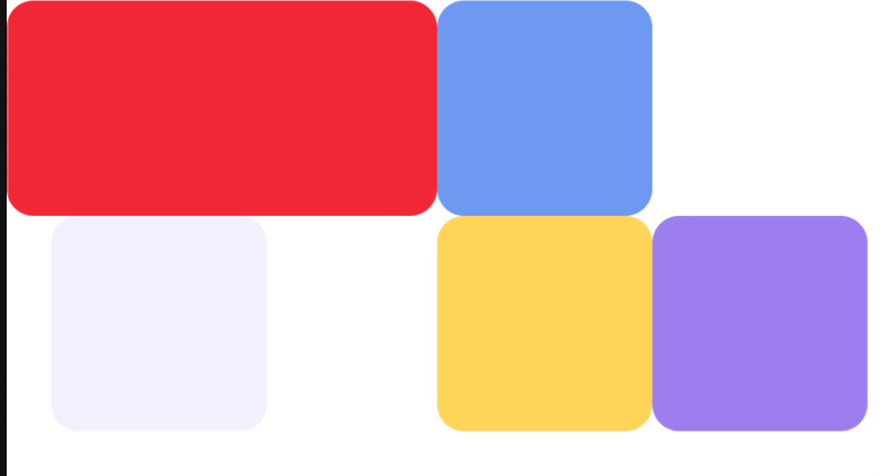
<StyledView w={48} h={48}>
  <StyledView w={'100%'} h={24} radius={12} bg={'red500'} t={0} />
  <StyledView w={24} h={24} radius={12} bg={'blue400'} pos={'absolute'} t={0} r={'-24'} />
  <StyledView w={24} h={24} radius={12} bg={'yellow300'} pos={'absolute'} b={0} r={-24} />
  <StyledView w={24} h={24} radius={12} bg={'violet400'} pos={'absolute'} b={0} r={'-48'} />
  <StyledView w={24} h={24} radius={12} bg={'violet50'} pos={'absolute'} b={0} l={'sidePadding'} />
</StyledView>
It can be defined as follows:
Method 1 - use createSxComponent HOC
import type { ComponentProps } from 'react';
import { View } from 'react-native';
import { createSxComponent } from '@react-native-styled-system/core';

export const StyledView = createSxComponent(View)();
export type StyledViewProps = ComponentProps<typeof StyledView>;
createSxComponent and createSxTextComponent are simple but may have limitations in their usage.
These HOCs simply add style-related fields to the Props and create a style object to pass to the passed view.
Method 2 - use useSx hook manually
import { forwardRef, Ref, PropsWithChildren } from 'react';
import { View, ViewProps } from 'react-native';
import { SxProps, useSx } from '@react-native-styled-system/core';

type StyledViewProps = PropsWithChildren<ViewProps & SxProps>;
const StyledView = forwardRef((props: StyledViewProps, ref: Ref<View>) => {
  const { getStyle, filteredProps } = useSx(props);
  return <View ref={ref} style={getStyle()} {...filteredProps} />;
});

export { StyledView };
export type { StyledViewProps };
useSx is responsible for receiving SxProps and converting it to ViewStyle.
You can call the getStyle function returned by useSx and pass it to the style prop of the desired view.
The prop type of a component containing the SxProps type includes all the keys included in SxProps.
Therefore, if all props from the parent are passed through object destruction like in the existing {...props}, the keys do not overlap.
You need to be careful not to do so.
Also, when using props as is, it must always come before style so as not to overwrite the style of getStyle().
To prevent this, you can use filteredProps in the return value of useSx.
filteredProps represents a new prop that filters all style-related fields such as style, sx, w, and width.
Example of refactoring an existing component
Let's look at how to refactor existing components as follows.
type Props = {
  style?: StyleProp<ViewStyle>;
  title?: string;
  body?: string;
};
const ExistComponent = ({
  style,
  title,
  body,
}: Props) => {
  return (
    <View
      style={[style, { alignItems: 'center', justifyContent: 'center' }]}
    >
...
This changes to:
type Props = {
  style?: StyleProp<ViewStyle>;
  title?: string;
  body?: string;
} & SxProps;
const ScreenErrorFallback = (props: Props) => {
  const { title, body } = props;
  const { getStyle } = useSx(props);
  const getSxStyle = useSxStyle();
  return (
    <View
      style={[getStyle(), getSxStyle({ center: true })]}
      pointerEvents={'box-none'}
    >
There are a few things to keep in mind.
useSxincludesprops.stylein the automatically created style output. There is no need to addstyleas a prop tostyleofView.- Always pass all
propsobjects themselves touseSxto avoid missing any properties.useSxProperties that are not used internally are ignored and not changed. - Fixed style overwriting
propscan be applied withgetSxStyle. centeris a shortcut forjustifyContent: center,alignItems: center.
Example without Props destruction
If you need a style object that can control multiple views in a component's props or do not want props destruction,
You can define a component using the sx prop as follows.
import { PropsWithChildren, forwardRef, Ref } from 'react';
import { ScrollViewProps, ScrollView } from 'react-native';
import { SxProps, useSx } from '@react-native-styled-system/core';

type StyledScrollViewProps = PropsWithChildren<
  {
    contentContainerSx?: SxProps;
  } & Omit<ScrollViewProps, 'contentContainerStyle'> &
    SxProps
>;
const StyledScrollView = forwardRef((props: StyledScrollViewProps, ref: Ref<ScrollView>) => {
  const { getStyle, filteredProps } = useSx(props);
  const { getStyle: contentContainerStyle } = useSx(props.contentContainerSx);
  return (
    <ScrollView ref={ref} style={getStyle()} contentContainerStyle={contentContainerStyle()} {...filteredProps} />
  );
});

export { StyledScrollView };
export type { StyledScrollViewProps };
This is a redefinition of ScrollView.
In addition to style, ScrollView has one more style prop called contentContainerStyle.
Therefore, it is accepted as a field called contentContainerSx as a SxProps type, and the contentContainerStyle of the original ScrollViewProps is created using Omit.
Be prepared for any possible bugs.
I still feel like there is a lot of code that needs to be written in this example, so I recommend improving it to a simpler Helper API.
We also plan to support several props of ScrollView separately.