Interface NaverMapViewProps
accessibilityActions?: readonly Readonly<
{ label?: string; name: string },
>[];
accessibilityElementsHidden?: boolean;
accessibilityHint?: string;
accessibilityIgnoresInvertColors?: boolean;
accessibilityLabel?: string;
accessibilityLabelledBy?: string | string[];
accessibilityLanguage?: string;
accessibilityLargeContentTitle?: string;
accessibilityLiveRegion?: "none" | "polite" | "assertive";
accessibilityRespondsToUserInteraction?: boolean;
accessibilityRole?: AccessibilityRole;
accessibilityShowsLargeContentViewer?: boolean;
accessibilityState?: AccessibilityState;
accessibilityValue?: AccessibilityValue;
accessibilityViewIsModal?: boolean;
accessible?: boolean;
animationDuration?: number;
animationEasing?: CameraAnimationEasing;
"aria-busy"?: boolean;
"aria-checked"?: boolean | "mixed";
"aria-disabled"?: boolean;
"aria-expanded"?: boolean;
"aria-hidden"?: boolean;
"aria-label"?: string;
"aria-labelledby"?: string;
"aria-live"?: "polite" | "assertive" | "off";
"aria-modal"?: boolean;
"aria-selected"?: boolean;
"aria-valuemax"?: number;
"aria-valuemin"?: number;
"aria-valuenow"?: number;
"aria-valuetext"?: string;
buildingHeight?: number;
camera?: Camera;
children?: ReactNode;
clusters?: {
animate?: boolean;
height?: number;
markers: ClusterMarkerProp[];
maxZoom?: number;
minZoom?: number;
screenDistance?: number;
width?: number;
}[];
collapsable?: boolean;
collapsableChildren?: boolean;
extent?: Region;
focusable?: boolean;
fpsLimit?: number;
hasTVPreferredFocus?: boolean;
hitSlop?: null
| number
| Insets;
id?: string;
importantForAccessibility?: "auto" | "yes" | "no" | "no-hide-descendants";
initialCamera?: Camera;
initialRegion?: Region;
isExtentBoundedInKorea?: boolean;
isIndoorEnabled?: boolean;
isLiteModeEnabled?: boolean;
isNightModeEnabled?: boolean;
isRotateGesturesEnabled?: boolean;
isScrollGesturesEnabled?: boolean;
isShowCompass?: boolean;
isShowIndoorLevelPicker?: boolean;
isShowLocationButton?: boolean;
isShowScaleBar?: boolean;
isShowZoomControls?: boolean;
isStopGesturesEnabled?: boolean;
isTiltGesturesEnabled?: boolean;
isTVSelectable?: boolean;
isUseTextureViewAndroid?: boolean;
isZoomGesturesEnabled?: boolean;
layerGroups?: {
BICYCLE: boolean;
BUILDING: boolean;
CADASTRAL: boolean;
MOUNTAIN: boolean;
TRAFFIC: boolean;
TRANSIT: boolean;
};
lightness?: number;
locale?: string;
logoAlign?: LogoAlign;
logoMargin?: Partial<Rect>;
mapPadding?: Partial<Rect>;
mapType?: MapType;
maxZoom?: number;
minZoom?: number;
nativeID?: string;
needsOffscreenAlphaCompositing?: boolean;
onAccessibilityAction?: (event: AccessibilityActionEvent) => void;
onAccessibilityEscape?: () => void;
onAccessibilityTap?: () => void;
onCameraChanged?: (
params: Camera & { reason: CameraChangeReason; region: Region },
) => void;
onCameraIdle?: (params: Camera & { region: Region }) => void;
onInitialized?: () => void;
onLayout?: (event: LayoutChangeEvent) => void;
onMagicTap?: () => void;
onMoveShouldSetResponder?: (event: GestureResponderEvent) => boolean;
onMoveShouldSetResponderCapture?: (event: GestureResponderEvent) => boolean;
onOptionChanged?: () => void;
onPointerCancel?: (event: PointerEvent) => void;
onPointerCancelCapture?: (event: PointerEvent) => void;
onPointerDown?: (event: PointerEvent) => void;
onPointerDownCapture?: (event: PointerEvent) => void;
onPointerEnter?: (event: PointerEvent) => void;
onPointerEnterCapture?: (event: PointerEvent) => void;
onPointerLeave?: (event: PointerEvent) => void;
onPointerLeaveCapture?: (event: PointerEvent) => void;
onPointerMove?: (event: PointerEvent) => void;
onPointerMoveCapture?: (event: PointerEvent) => void;
onPointerUp?: (event: PointerEvent) => void;
onPointerUpCapture?: (event: PointerEvent) => void;
onResponderEnd?: (event: GestureResponderEvent) => void;
onResponderGrant?: (event: GestureResponderEvent) => void;
onResponderMove?: (event: GestureResponderEvent) => void;
onResponderReject?: (event: GestureResponderEvent) => void;
onResponderRelease?: (event: GestureResponderEvent) => void;
onResponderStart?: (event: GestureResponderEvent) => void;
onResponderTerminate?: (event: GestureResponderEvent) => void;
onResponderTerminationRequest?: (event: GestureResponderEvent) => boolean;
onStartShouldSetResponder?: (event: GestureResponderEvent) => boolean;
onStartShouldSetResponderCapture?: (
event: GestureResponderEvent,
) => boolean;
onTapClusterLeaf?: (params: { markerIdentifier: string }) => void;
onTapMap?: (params: Coord & { x: number; y: number }) => void;
onTouchCancel?: (event: GestureResponderEvent) => void;
onTouchEnd?: (event: GestureResponderEvent) => void;
onTouchEndCapture?: (event: GestureResponderEvent) => void;
onTouchMove?: (event: GestureResponderEvent) => void;
onTouchStart?: (event: GestureResponderEvent) => void;
pointerEvents?: "box-none" | "none" | "box-only" | "auto";
region?: Region;
removeClippedSubviews?: boolean;
renderToHardwareTextureAndroid?: boolean;
role?: Role;
screenReaderFocusable?: boolean;
shouldRasterizeIOS?: boolean;
style?: StyleProp<ViewStyle>;
symbolPerspectiveRatio?: number;
symbolScale?: number;
tabIndex?: 0 | -1;
testID?: string;
tvParallaxMagnification?: number;
tvParallaxShiftDistanceX?: number;
tvParallaxShiftDistanceY?: number;
tvParallaxTiltAngle?: number;
}
Hierarchy
- ViewProps
- NaverMapViewProps
Index
Events
Animation
Camera
Gesture
Logo
Map Look & Feel
Properties
Events
Optionalon
어떤 이유에 의해서건 카메라가 움직이면 카메라 변경 이벤트가 발생합니다.
reason은 이벤트를 발생시킨 카메라 이동의 원인입니다. reason을 이용해 카메라 이동의 원인을 지정할 수 있으며, 이벤트 리스너 내에서 이 값을 이용해 어떤 원인에 의해 발생한 이벤트인지 판단할 수 있습니다.
latitude, longitude, zoom, tilt, bearing은 카메라와 관련된 속성이며, 카메라 변경 이벤트에 대한 Region을 이벤트로 받으려면 region인자를 사용할 수 있습니다.
Optionalon
카메라의 움직임이 끝나 대기 상태가 되면 카메라 대기 이벤트가 발생합니다.
카메라는 다음과 같은 시점에 대기 상태가 된 것으로 간주되어 이벤트가 발생합니다.
- 카메라가 애니메이션 없이 움직일 때. 단, 사용자가 제스처로 지도를 움직이는 경우 제스처가 완전히 끝날 때까지는 연속적인 이동으로 간주되어 이벤트가 발생하지 않습니다.
- 카메라 애니메이션이 완료될 때.
- NaverMap.cancelTransitions()가 호출되어 카메라 애니메이션이 명시적으로 취소될 때.
Optionalon
지도 객체가 초기화가 완료된 뒤에 호출됩니다.
Optionalon
지도 유형, 디스플레이 옵션 등 지도와 관련된 옵션이 변경되면 이벤트가 발생합니다. 지도의 옵션이 변경되면 콜백 메서드가 호출됩니다.
이 이벤트는 지도의 옵션에 따라 UI나 다른 속성을 변경하고자 할 때 유용합니다. 예를 들어 지도가 야간 모드로 변경되면 마커의 색상도 어두운 색으로 변경해야 자연스러운데, 이런 경우에 옵션 변경 이벤트를 사용할 수 있습니다.
Optionalon
클러스터 Leaf 마커를 클릭했을 때 발생하는 이벤트입니다.
Optionalon
맵을 클릭했을 때 발생하는 이벤트입니다.
Animation
Optionalanimation
camera, region이 변경될 때 카메라 이동의 애니메이션 지속시간, milliseconds
0일 때는 애니메이션이 작동하지 않습니다.
Optionalanimation
camera, region이 변경될 때 카메라 이동의 애니메이션 Easing
Camera
Optionalcamera
카메라의 위치를 조절합니다. region이 존재해도 camera가 설정되면 동작하지 않습니다.
Optionalinitial
맵이 생성된 후 첫 카메라 설정입니다.
camera를 사용하지 않을 때만 사용해야합니다.
컴포넌트가 mount되고 변경해도 동작하지 않습니다.
Optionalinitial
맵이 생성된 후 첫 위치 설정입니다.
region를 사용하지 않을 때만 사용해야합니다.
컴포넌트가 mount되고 변경해도 동작하지 않습니다.
Optionalregion
해당 영역이 완전히 보이는 좌표와 최대 줌 레벨로 카메라가 이동합니다.
camera가 존재한다면 동작하지 않습니다.
latitude, longtidue는 지도의 south-west(위도, 경도가 낮은 부분)를 의미합니다.
latitudeDelta, longitudeDelta는 각 위도 경도로 얼마만큼의 범위를 가질 것인지를 의미합니다.
항상 양수입니다.
예를 들어, latitudeDelta가 0.1이라면 위도가 지도의 보이는 곳의 끝과 끝에서 0.1이 차이난다는 것을 의미합니다.
하지만 longitudeDelta가 특정 값보다 커서 최대 줌 레벨이 더 작아진다면 0.1보다 더 차이나게 될 수도 있고 반대도 같습니다.
Gesture
Optionalis
회전: 두 개의 손가락으로 지도를 돌리면 베어링 각도가 바뀝니다.
Optionalis
스크롤: 한 개 또는 두 개 이상의 손가락으로 지도를 드래그하면 카메라가 손가락을 따라 이동합니다.
Optionalis
스톱: 카메라 애니메이션이 진행 중일 때 지도를 탭하면 애니메이션이 취소되고 카메라가 현재 위치에 멈춥니다.
Optionalis
틸트: 두 개의 손가락으로 지도를 위아래로 드래그하면 기울임 각도가 바뀝니다.
Optionalis
줌: 지도를 더블 탭하면 줌 레벨이 한 단계 확대됩니다. 두 손가락 탭하면 한 단계 축소됩니다. 핀치와 스트레치 또는 한 손가락 줌 제스처로도 지도의 줌 레벨을 변경할 수 있습니다.
Map Look & Feel
Optionallayer
BICYCLE: boolean;
BUILDING: boolean;
CADASTRAL: boolean;
MOUNTAIN: boolean;
TRAFFIC: boolean;
TRANSIT: boolean;
}
바닥 지도 위에 부가적인 정보를 나타내는 레이어 그룹을 노출할 수 있습니다.
레이어 그룹은 지도 유형과 달리 동시에 두 개 이상을 활성화할 수 있습니다. 단, 지도 유형에 따라 표현 가능한 레이어 그룹이 정해져 있습니다. 지도 유형이 특정 레이어 그룹을 지원하지 않으면 활성화하더라도 해당하는 요소가 노출되지 않습니다.
default값은 BUILDING만 활성화되어있는 상태입니다.
Type declaration
BICYCLE: boolean
자전거 그룹입니다. 활성화할 경우 자전거 도로, 자전거 주차대 등 자전거와 관련된 요소가 노출됩니다.
BUILDING: boolean
건물 그룹입니다. 활성화할 경우 건물 형상, 주소 심벌 등 건물과 관련된 요소가 노출됩니다. 기본적으로 활성화됩니다.
CADASTRAL: boolean
지적편집도 그룹입니다. 활성화할 경우 지적편집도가 노출됩니다.
MOUNTAIN: boolean
등산로 그룹입니다. 활성화할 경우 등산로, 등고선 등 등산과 관련된 요소가 노출됩니다.
TRAFFIC: boolean
실시간 교통정보 그룹입니다. 활성화할 경우 실시간 교통정보가 노출됩니다.
TRANSIT: boolean
대중교통 그룹입니다. 활성화할 경우 철도, 지하철 노선, 버스정류장 등 대중교통과 관련된 요소가 노출됩니다.
Optionalmap
mapType 속성을 지정하면 지도의 유형을 변경할 수 있습니다. 지도의 유형을 변경하면 가장 바닥에 나타나는 배경 지도의 스타일이 변경됩니다.
Properties
Optionalaccessibility
Provides an array of custom actions available for accessibility.
Optionalaccessibility
A Boolean value indicating whether the accessibility elements contained within this accessibility element are hidden to the screen reader.
Optionalaccessibility
An accessibility hint helps users understand what will happen when they perform an action on the accessibility element when that result is not obvious from the accessibility label.
Optionalaccessibility
Optionalaccessibility
Overrides the text that's read by the screen reader when the user interacts with the element. By default, the label is constructed by traversing all the children and accumulating all the Text nodes separated by space.
Optionalaccessibility
Identifies the element that labels the element it is applied to. When the assistive technology focuses on the component with this props, the text is read aloud. The value should should match the nativeID of the related element.
Optionalaccessibility
By using the accessibilityLanguage property, the screen reader will understand which language to use while reading the element's label, value and hint. The provided string value must follow the BCP 47 specification (https://www.rfc-editor.org/info/bcp47). https://reactnative.dev/docs/accessibility#accessibilitylanguage-ios
Optionalaccessibility
When accessibilityShowsLargeContentViewer is set, this string will be used as title for the large content viewer.
https://reactnative.dev/docs/accessibility#accessibilitylargecontenttitle
Optionalaccessibility
Indicates to accessibility services whether the user should be notified when this view changes. Works for Android API >= 19 only.
Optionalaccessibility
Blocks the user from interacting with the component through keyboard while still allowing screen reader to interact with it if this View is still accessible.
Optionalaccessibility
Accessibility Role tells a person using either VoiceOver on iOS or TalkBack on Android the type of element that is focused on.
Optionalaccessibility
A Boolean value that indicates whether or not to show the item in the large content viewer. Available on iOS 13.0+ https://reactnative.dev/docs/accessibility#accessibilityshowslargecontentviewer
Optionalaccessibility
Accessibility State tells a person using either VoiceOver on iOS or TalkBack on Android the state of the element currently focused on.
Optionalaccessibility
Represents the current value of a component. It can be a textual description of a component's value, or for range-based components, such as sliders and progress bars, it contains range information (minimum, current, and maximum).
Optionalaccessibility
A Boolean value indicating whether VoiceOver should ignore the elements within views that are siblings of the receiver.
Optionalaccessible
When true, indicates that the view is an accessibility element. By default, all the touchable elements are accessible.
Optionalaria-
alias for accessibilityState
see https://reactnative.dev/docs/accessibility#accessibilitystate
Optionalaria-
Optionalaria-
Optionalaria-
Optionalaria-
A value indicating whether the accessibility elements contained within this accessibility element are hidden.
Optionalaria-
Alias for accessibilityLabel https://reactnative.dev/docs/view#accessibilitylabel https://github.com/facebook/react-native/issues/34424
Optionalaria-
Identifies the element that labels the element it is applied to. When the assistive technology focuses on the component with this props, the text is read aloud. The value should should match the nativeID of the related element.
Optionalaria-
Indicates to accessibility services whether the user should be notified when this view changes. Works for Android API >= 19 only.
Optionalaria-
Optionalaria-
Optionalaria-
Optionalaria-
Optionalaria-
Optionalaria-
Optionalbuilding
지도가 기울어지면 건물이 입체적으로 표시됩니다. buildingHeight 속성을 사용하면 입체적으로 표현되는 건물의 높이를 지정할 수 있습니다. 값은 0~1의 비율로 지정할 수 있으며, 0으로 지정하면 지도가 기울어지더라도 건물이 입체적으로 표시되지 않습니다.
Optionalchildren
Optionalclusters
animate?: boolean;
height?: number;
markers: ClusterMarkerProp[];
maxZoom?: number;
minZoom?: number;
screenDistance?: number;
width?: number;
}[]
한 화면에 대량의 마커가 노출되면 성능이 저하될 뿐만 아니라 여러 마커가 겹쳐 나타나므로 시인성이 떨어집니다. 마커의 겹침 처리 기능을 사용하면 시인성을 일부 향상시킬 수 있으나 겹침 처리로 인해 가려진 마커의 정보를 알 수 없으며, 성능도 여전히 저하됩니다. 마커 클러스터링 기능을 이용하면 카메라의 줌 레벨에 따라 근접한 마커를 클러스터링해 성능과 시인성을 모두 향상시킬 수 있습니다.
Type declaration
Optionalanimate?: boolean카메라 확대/축소시 클러스터가 펼쳐지는/합쳐지는 애니메이션을 적용할지 여부.
Optionalheight?: number클러스터 마커의 높이
markers: ClusterMarkerProp[]
OptionalmaxZoom?: number클러스터링할 최대 줌 레벨.
카메라의 줌 레벨이 최대 줌 레벨보다 높다면 두 데이터가 화면상 기준 거리보다 가깝더라도 더 이상 클러스터링되지 않습니다. 예를 들어, 클러스터링할 최대 줌 레벨이 16이라면, 카메라의 줌 레벨을 17레벨 이상으로 확대하면 모든 데이터가 클러스터링되지 않고 낱개로 나타납니다. 따라서 클러스터링할 최대 줌 레벨이 지도의 최대 줌 레벨보다 크거나 같다면 카메라를 최대 줌 레벨로 확대하더라도 일부 데이터는 여전히 클러스터링된 채 더 이상 펼쳐지지 않을 수 있습니다.
OptionalminZoom?: number클러스터링할 최소 줌 레벨.
카메라의 줌 레벨이 최소 줌 레벨보다 낮다면 두 데이터가 화면상 기준 거리보다 가깝더라도 더 이상 클러스터링되지 않습니다. 예를 들어, 클러스터링할 최소 줌 레벨이 4라면, 카메라의 줌 레벨을 3레벨 이하로 축소하더라도 4레벨의 클러스터가 더 이상 클러스터링되지 않고 그대로 유지됩니다.
OptionalscreenDistance?: numberOptionalwidth?: number클러스터 마커의 넓이
Optionalcollapsable
Views that are only used to layout their children or otherwise don't draw anything may be automatically removed from the native hierarchy as an optimization. Set this property to false to disable this optimization and ensure that this View exists in the native view hierarchy.
Optionalcollapsable
Setting to false prevents direct children of the view from being removed
from the native view hierarchy, similar to the effect of setting
collapsable={false} on each child.
Optionalextent
extent 속성을 지정하면 카메라의 대상 지점을 영역 내로 제한할 수 있습니다. 카메라가 제한 영역을 벗어나도록 API를 호출하더라도 대상 지점이 영역 내로 조정됩니다.
카메라 영역을 제한할 때 최소 줌 레벨도 함께 제한하는 것이 좋습니다. 그렇지 않으면 지도가 축소되었을 때 제한 영역이 너무 작게 나타날 수 있습니다.
Optionalfocusable
Whether this View should be focusable with a non-touch input device, eg. receive focus with a hardware keyboard.
Optionalfps
지도의 최대 초당 프레임 수(FPS, frames per second)를 지정합니다.
지도 객체가 생길때의 초기값만 동작하고 동적으로 바꿀 수 없습니다.
안드로이드에서만 동작합니다.
기본값은 제한을 두지 않음을 의미하는 0입니다.
Optionalhas
(Apple TV only) May be set to true to force the Apple TV focus engine to move focus to this view.
Optionalhit
This defines how far a touch event can start away from the view. Typical interface guidelines recommend touch targets that are at least 30 - 40 points/density-independent pixels. If a Touchable view has a height of 20 the touchable height can be extended to 40 with hitSlop={{top: 10, bottom: 10, left: 0, right: 0}} NOTE The touch area never extends past the parent view bounds and the Z-index of sibling views always takes precedence if a touch hits two overlapping views.
Optionalid
Used to reference react managed views from native code.
Optionalimportant
[Android] Controlling if a view fires accessibility events and if it is reported to accessibility services.
Optionalis
한반도로 extent를 제한합니다. extent가 존재한다면 동작하지 않습니다.
Optionalis
indoorMapEnabled 속성을 사용하면 실내지도를 활성화할 수 있습니다. 실내지도가 활성화되면 줌 레벨이 일정 수준 이상이고 실내지도가 있는 영역에 지도의 중심이 위치할 경우 자동으로 해당 영역에 대한 실내지도가 나타납니다. 단, 지도 유형이 실내지도를 지원하지 않으면 실내지도를 활성화하더라도 아무런 변화가 일어나지 않습니다. Basic, Terrain 지도 유형만이 실내지도를 지원합니다.
Optionalis
이 속성을 사용하면 라이트 모드를 활성화할 수 있습니다. 라이트 모드가 활성화되면 지도의 로딩이 빨라지고 메모리 소모가 줄어듭니다. 그러나 다음과 같은 제약이 생깁니다.
- 지도의 전반적인 화질이 하락합니다.
- Navi 지도 유형을 사용할 수 없습니다.
- 레이어 그룹을 활성화할 수 없습니다.
- 실내지도, 야간 모드를 사용할 수 없습니다.
- 디스플레이 옵션을 변경할 수 없습니다.
- 카메라가 회전하거나 기울어지면 지도 심벌도 함께 회전하거나 기울어집니다.
- 줌 레벨이 커지거나 작아지면 지도 심벌도 일정 정도 함께 커지거나 작아집니다.
- 지도 심벌의 클릭 이벤트를 처리할 수 없습니다.
- 마커와 지도 심벌 간 겹침을 처리할 수 없습니다.
따라서 라이트 모드는 꼭 필요한 상황에만 제한적으로 사용하는 것이 좋습니다.
Optionalis
nightModeEnabled 속성을 사용하면 야간 모드를 활성화할 수 있습니다. 야간 모드가 활성화되면 지도의 전반적인 스타일이 어두운 톤으로 변경됩니다. 단, 지도 유형이 야간 모드를 지원하지 않을 경우 야간 모드를 활성화하더라도 아무런 변화가 일어나지 않습니다. Navi 지도 유형만이 야간 모드를 지원합니다.
Optionalis
나침반: 카메라의 회전 및 틸트 상태를 표현합니다. 탭하면 카메라의 헤딩과 틸트가 0으로 초기화됩니다. 헤딩과 틸트가 0이 되면 자동으로 사라집니다.
Optionalis
실내지도 층 피커: 노출 중인 실내지도 구역의 층 정보를 표현합니다 층을 선택하면 해당 층의 실내지도가 노출됩니다. 실내지도가 보이는 상황에만 나타납니다.
Optionalis
현위치 버튼: 위치 추적 모드를 표현합니다. 탭하면 모드가 변경됩니다.
Optionalis
축척 바: 지도의 축척을 표현합니다. 지도를 조작하는 기능은 없습니다.
Optionalis
줌 버튼: 탭하면 지도의 줌 레벨을 1씩 증가 또는 감소합니다.
Optionalis
(Apple TV only) When set to true, this view will be focusable and navigable using the Apple TV remote.
Optionalis
안드로이드에서 SurfaceView대신 TextureView를 사용합니다.
컴포넌트가 mount되고 변경해도 동작하지 않습니다.
Optionallightness
lightness 속성을 사용하면 지도의 밝기를 지정할 수 있습니다. 지도의 밝기를 지정하더라도 오버레이의 밝기는 변경되지 않으므로 오버레이를 강조하고자 할 때 사용할 수 있습니다. 값은 -1~1의 비율로 지정할 수 있으며, -1에 가까울수록 어두워지고 1에 가까울수록 밝아집니다.
Optionallocale
지도의 언어를 지정합니다.
Optionalmap
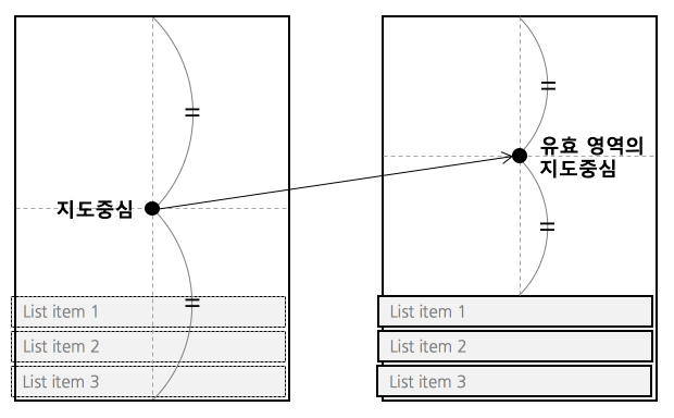
콘텐츠 패딩을 지정할 수 있습니다. 다음 그림과 같이 UI 요소가 지도의 일부를 덮을 경우, 카메라는 지도 뷰의 중심에 위치하므로 실제로 보이는 지도의 중심과 카메라의 위치가 불일치하게 됩니다.
Optionalmax
카메라의 최대 줌 레벨입니다.
Optionalmin
카메라의 최소 줌 레벨입니다.
Optionalnative
Used to reference react managed views from native code.
Optionalneeds
Whether this view needs to rendered offscreen and composited with an alpha in order to preserve 100% correct colors and blending behavior. The default (false) falls back to drawing the component and its children with an alpha applied to the paint used to draw each element instead of rendering the full component offscreen and compositing it back with an alpha value. This default may be noticeable and undesired in the case where the View you are setting an opacity on has multiple overlapping elements (e.g. multiple overlapping Views, or text and a background).
Rendering offscreen to preserve correct alpha behavior is extremely expensive and hard to debug for non-native developers, which is why it is not turned on by default. If you do need to enable this property for an animation, consider combining it with renderToHardwareTextureAndroid if the view contents are static (i.e. it doesn't need to be redrawn each frame). If that property is enabled, this View will be rendered off-screen once, saved in a hardware texture, and then composited onto the screen with an alpha each frame without having to switch rendering targets on the GPU.
Optionalon
When accessible is true, the system will try to invoke this function when the user performs an accessibility custom action.
Optionalon
When accessible is true, the system will invoke this function when the user performs the escape gesture (scrub with two fingers).
Optionalon
When accessible is true, the system will try to invoke this function when the user performs accessibility tap gesture.
Optionalon
Invoked on mount and layout changes with
{nativeEvent: { layout: {x, y, width, height}}}.
Optionalon
When accessible is true, the system will invoke this function when the user performs the magic tap gesture.
Optionalon
Called for every touch move on the View when it is not the responder: does this view want to "claim" touch responsiveness?
Optionalon
onStartShouldSetResponder and onMoveShouldSetResponder are called with a bubbling pattern, where the deepest node is called first. That means that the deepest component will become responder when multiple Views return true for *ShouldSetResponder handlers. This is desirable in most cases, because it makes sure all controls and buttons are usable.
However, sometimes a parent will want to make sure that it becomes responder. This can be handled by using the capture phase. Before the responder system bubbles up from the deepest component, it will do a capture phase, firing on*ShouldSetResponderCapture. So if a parent View wants to prevent the child from becoming responder on a touch start, it should have a onStartShouldSetResponderCapture handler which returns true.
Optionalon
Optionalon
Optionalon
Optionalon
Optionalon
Optionalon
Optionalon
Optionalon
Optionalon
Optionalon
Optionalon
Optionalon
Optionalon
If the View returns true and attempts to become the responder, one of the following will happen:
Optionalon
The View is now responding for touch events. This is the time to highlight and show the user what is happening
Optionalon
The user is moving their finger
Optionalon
Something else is the responder right now and will not release it
Optionalon
Fired at the end of the touch, ie "touchUp"
Optionalon
Optionalon
The responder has been taken from the View. Might be taken by other views after a call to onResponderTerminationRequest, or might be taken by the OS without asking (happens with control center/ notification center on iOS)
Optionalon
Something else wants to become responder. Should this view release the responder? Returning true allows release
Optionalon
Does this view want to become responder on the start of a touch?
Optionalon
onStartShouldSetResponder and onMoveShouldSetResponder are called with a bubbling pattern, where the deepest node is called first. That means that the deepest component will become responder when multiple Views return true for *ShouldSetResponder handlers. This is desirable in most cases, because it makes sure all controls and buttons are usable.
However, sometimes a parent will want to make sure that it becomes responder. This can be handled by using the capture phase. Before the responder system bubbles up from the deepest component, it will do a capture phase, firing on*ShouldSetResponderCapture. So if a parent View wants to prevent the child from becoming responder on a touch start, it should have a onStartShouldSetResponderCapture handler which returns true.
Optionalon
Optionalon
Optionalon
Optionalon
Optionalon
Optionalpointer
In the absence of auto property, none is much like CSS's none value. box-none is as if you had applied the CSS class:
.box-none { pointer-events: none; } .box-none * { pointer-events: all; }
box-only is the equivalent of
.box-only { pointer-events: all; } .box-only * { pointer-events: none; }
But since pointerEvents does not affect layout/appearance, and we are already deviating from the spec by adding additional modes, we opt to not include pointerEvents on style. On some platforms, we would need to implement it as a className anyways. Using style or not is an implementation detail of the platform.
Optionalremove
This is a special performance property exposed by RCTView and is useful for scrolling content when there are many subviews, most of which are offscreen. For this property to be effective, it must be applied to a view that contains many subviews that extend outside its bound. The subviews must also have overflow: hidden, as should the containing view (or one of its superviews).
Optionalrender
Whether this view should render itself (and all of its children) into a single hardware texture on the GPU.
On Android, this is useful for animations and interactions that only modify opacity, rotation, translation, and/or scale: in those cases, the view doesn't have to be redrawn and display lists don't need to be re-executed. The texture can just be re-used and re-composited with different parameters. The downside is that this can use up limited video memory, so this prop should be set back to false at the end of the interaction/animation.
Optionalrole
Indicates to accessibility services to treat UI component like a specific role.
Optionalscreen
Enables the view to be screen reader focusable, not keyboard focusable.
Optionalshould
Whether this view should be rendered as a bitmap before compositing.
On iOS, this is useful for animations and interactions that do not modify this component's dimensions nor its children; for example, when translating the position of a static view, rasterization allows the renderer to reuse a cached bitmap of a static view and quickly composite it during each frame.
Rasterization incurs an off-screen drawing pass and the bitmap consumes memory. Test and measure when using this property.
Optionalstyle
Optionalsymbol
지도를 기울이면 가까이 있는 심벌은 크게, 멀리 있는 심벌은 작게 그려집니다. symbolPerspectiveRatio 속성을 사용하면 심벌의 원근 효과를 조절할 수 있습니다. 0~1의 비율로 지정할 수 있으며, 값이 작을수록 원근감이 줄어들어 0이 되면 원근 효과가 완전히 사라집니다.
Optionalsymbol
symbolScale 속성을 사용하면 심벌의 크기를 변경할 수 있습니다. 0~2의 비율로 지정할 수 있으며, 값이 클수록 심벌이 커집니다.
Optionaltab
Indicates whether this View should be focusable with a non-touch input device, eg. receive focus with a hardware keyboard.
See https://developer.mozilla.org/en-US/docs/Web/HTML/Global_attributes/tabindex
for more details.
Supports the following values:
- 0 (View is focusable)
- -1 (View is not focusable)
Optionaltest
Used to locate this view in end-to-end tests.
Optionaltv
(Apple TV only) May be used to change the appearance of the Apple TV parallax effect when this view goes in or out of focus. Defaults to 1.0.
Optionaltv
(Apple TV only) May be used to change the appearance of the Apple TV parallax effect when this view goes in or out of focus. Defaults to 2.0.
Optionaltv
(Apple TV only) May be used to change the appearance of the Apple TV parallax effect when this view goes in or out of focus. Defaults to 2.0.
Optionaltv
(Apple TV only) May be used to change the appearance of the Apple TV parallax effect when this view goes in or out of focus. Defaults to 0.05.